A short yet detailed guide to styling components with create-react-app with Sass and CSS Modules, which now is part of CRA.
Up until the release of create-react-app v2, if you wanted to include Sass or CSS Modules in your project, you would have to eject from create-react-app, learn Webpack configurations, install Sass loaders and configure it yourself.
[topads][/topads]
Not anymore. The team at Facebook released create-react-app v2 and among the many improvements, they gave us the ability to use Sass and CSS Modules right out of the box, and in this tutorial, you will learn how simple it is to include them in your projects using create-react-app.
Let’s create a simple project to demonstrate this.
Getting Sassy with Sass
First, create a new project with the latest create-react-app. I will call mine cra-sass
npx create-react-app cra-sass
Aside: If you are unsure of what npx is, or what it does, basically it uses the latest packages from the npm registry, so you don’t need to have create-react-app locally installed.
You will need one new dependency for Sass support. Install node-sass (inside the cra-sass project)
yarn add sass
Now rename ./scr/App.css to ./src/App.scss.
Once that is done, open ./src/App.js and in line3 you will find import './App.css'. Change it to import './App.scss'
At this point you can run the app
yarn start
You will see the default template created by create-react-app looking good!
Let’s create another Sass file and name it variables.scss under ./src directory.
Open this newly created Sass file and copy the following
$primary-color: #282c34;
$secondary-color: #61dafb;
Now open App.scss and modify it as follows (updates highlighted)
@import './variables.scss';
.App {
  text-align: center;
}
.App-logo {
  animation: App-logo-spin infinite 20s linear;
  height: 40vmin;
}
.App-header {
  background-color: $primary-color;
  min-height: 100vh;
  display: flex;
  flex-direction: column;
  align-items: center;
  justify-content: center;
  font-size: calc(10px + 2vmin);
  color: white;
}
.App-link {
  color: $secondary-color;
}
@keyframes App-logo-spin {
  from {
    transform: rotate(0deg);
  }
  to {
    transform: rotate(360deg);
  }
}
As you can see, we are importing variables.scss and the variables we created for the background color and link color.
If you stopped the app, go ahead and run it again (yarn start). If you didn’t stop the app, head over to your browser and you will see the app still looks the same as before. That’s because we just extracted the colors to a separate file
With that in mind, you now have the full power of Sass within create-react-app without the need to eject and losing support for any future updates to the project.
But wait, there is more! When you build the app, create-react-app will use PostCSS with the Autoprefixer plugin to automatically add the required vendor prefixes.
This works with the browsers list in your package.json. By default, create-react-app ships with the following configuration
  "browserslist": {
    "production": [
      ">0.2%",
      "not dead",
      "not op_mini all"
    ],
    "development": [
      "last 1 chrome version",
      "last 1 firefox version",
      "last 1 safari version"
    ]
  }
These are the browsers that create-react-app is targeting by default.
If you need support for different browsers (say IE 10) you will need to include the specific browser as follows
  "browserslist": {
    "production": [
      ">0.2%",
      "not dead",
      "not op_mini all",
      "ie 10"
    ],
    "development": [
      "last 1 chrome version",
      "last 1 firefox version",
      "last 1 safari version"
    ]
  }
For a full list of browser queries, head over to the official Browserlist documentation.
One last thing, CSS Grid prefixing is turned off by default. If you need it, you can turn it on by adding /* autoprefixer grid: on */ to the top of your CSS file. However, there are limitations, so familiarize yourself with those.
[signupform][/signupform]
CSS Modules
The team at Facebook made it really easy to use CSS Modules with create-react-app. You just have to use the following naming convention: [name].module.css or [name].module.scss, where [name] is the name of your stylesheet.
Before proceeding with an example, if you are unsure about CSS Modules, here is the official definition from the repo:
A CSS Module is a CSS file in which allclass names and animation names are scoped locally by default.
Basically, the same class names do not clash when used in different CSS files. Say you have Button.css and Header.css, then in each of those files, you have a class named .bg-color like so
// Button.css
.bg-color{background:red;}

// Header.css
.bg-color{background:blue;}
When React runs, the classes will be actually named something like this .Button_bg-color__18rA{…} and .Header_bg-color__94tO{…}. They follow the following naming convention: [filename]\_[classname]\_\_[hash].
Continuing with the Sass example, open App.scss and add the following
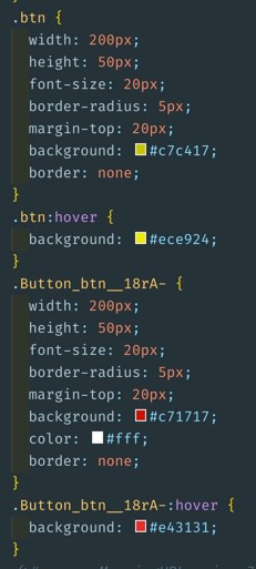
.btn {
  width: 200px;
  height: 50px;
  font-size: 20px;
  border-radius: 5px;
  margin-top: 20px;
  background: rgb(199, 196, 23);
  border: none;
  &:hover {
    background: rgb(236, 233, 36);
  }
}
Now open App.js and the highlighted code
import React, { Component } from 'react';
import logo from './logo.svg';
import './App.scss';
import Button from './Button';

class App extends Component {
  render() {
    return (
      <div className="App">
        <header className="App-header">
          <img src={logo} className="App-logo" alt="logo" />
          <p>
            Edit <code>src/App.js</code> and save to reload.
          </p>
          <a
            className="App-link"
            href="https://reactjs.org"
            target="_blank"
            rel="noopener noreferrer"
          >
            Learn React
          </a>
          <button
            className="btn"
            onClick={() => alert('I am globally styled')}>
              I am button 1 - Press Me
          </button>
          <Button />
        </header>
      </div>
    );
  }
}

export default App;
We are basically creating a button and assigning a .btn class to it. We also create a Button component.
Now, let’s actually create the Button component and the related stylesheet file under the ./src directory
touch Button.js Button.module.scss
Notice I am creating a CSS Module here
Open Button.module.scss and add the following
.btn {
  width: 200px;
  height: 50px;
  font-size: 20px;
  border-radius: 5px;
  margin-top: 20px;
  background: rgb(199, 23, 23);
  color: white;
  border: none;&:hover {
    background: rgb(228, 49, 49);
  }
}
To demonstrate, I am using the same class name (.btn) as in App.scss.
Now open Button.js and add the following
import React from 'react';
import { btn } from './Button.module.scss';

const Button = () => {
  return (
    <>
      <button
        className={btn}
        onClick={() => alert('I am styled with CSS Modules')}
      >
        I am button 2 - Press Me
      </button>
    </>
  );
};

export default Button;
Highlighted you will see how we can import the stylesheet to make use of CSS Modules.
You can use destructuring (as I am currently doing) or the dot notation like so
import styles from './Button.module.scss';
...
      <button
        className={styles.btn}
        onClick={() => alert('I am styled with CSS Modules')}
      >
        I am button 2 - Press Me
      </button>
...
It is time to run the app.
yarn start
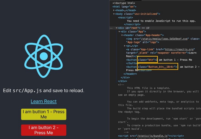
Notice the two classes are not clashing. The one globally created in App.scss stayed as .btn and the one created with CSS Modules is now .Button_btn__18rA.
Finally, let’s build the app.
yarn build
Open the generated stylesheet under ./build/static/css/main.[hash].css and you will notice both classes are present, but they don’t clash as they are named differently.
Conclusion
I hope you enjoyed this article and thank you for reading. If you have any questions, suggestions or corrections let me know in the comments below. Don’t forget to give this article a share and you can follow me on Twitter or connect with me on LinkedIn!
Thanks for reading!
Originally posted on Bits and Pieces
Consider giving back by getting me a coffee (or a couple) by clicking the following button:
[bottomads][/bottomads]